Practices for Designing a Corporate Website

We recently earned our first Clutch review and we couldn’t be happier for the five star rating that our partner gave us:
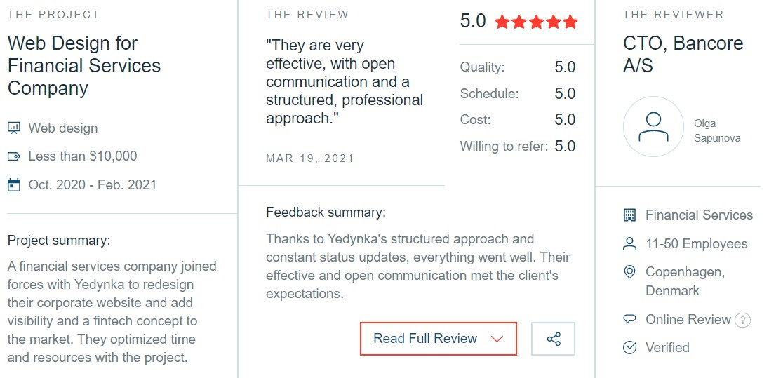
We initially joined the Clutch platform in order to show off projects that we had completed. But now they have also become a source of inspiration for our team in educating partners on the finer points of our work.
Today, we’ll be talking about the best practices for designing corporate websites.
What is a Corporate Website?
Before we begin the discussion, it’s important to be clear about what we mean by “corporate website”. Generally, any business-oriented online platform can be called a corporate website, but there is definitely a distinct image in people’s minds when those words are used.
For the purposes of this blog we won’t be talking about family-owned or niche businesses. We’ll limit the discussion to medium to large companies that employ more than 150 people. With that in mind let’s begin.
Dive Into Tropes
Never judge a book by its cover does not apply to corporate websites, especially if you want them to be competitive. Few people may admit it, but large parts of their decision-making process in choosing a service provider is if the visuals are “professional” enough.
Because of our experience working with such companies, we know that when users says “professional visuals” it basically means that the website looks like what they think it should look like.
For example, law offices should have images of courtroom paraphernalia, random bookcases, and facades of vaguely ancient Greek looking buildings. Every industry has visual and stereotypes that people will associate with that industry even without realizing it. Lean into those tropes so that you can communicate more information faster.
Simple Yet Unique
The next challenge is arranging or choosing visuals that would make the business distinct enough from the competition without overwhelming users with too much detail. Some ways to achieve this is through a slightly unusual color palette or a well integrated logo.
Don’t underestimate your user’s ability to pick up subtle differences. More often than not it’s the small things that will set the business apart from the rest of the field.
Strategize CTAs
Most corporate websites were built with one goal in mind and they do everything in their power to push users in that direction. Sometimes they fall into the trap of peppering every page with similar if not identical CTAs.
This is an annoying strategy and doesn’t help the user. Designers need to remember that while their corporate partners have a goal in mind, users also have their own agenda in visiting the site. If the design doesn’t lead them to the information they’re looking for, they will leave the site for more helpful pastures.
Content trumps CTAs in every situation. The sooner clients realize this, the happier everyone will become.
There you have it, three quick best practices on designing for corporate websites. If you want to learn more about the industry, or need help on a project of your own contact us today.